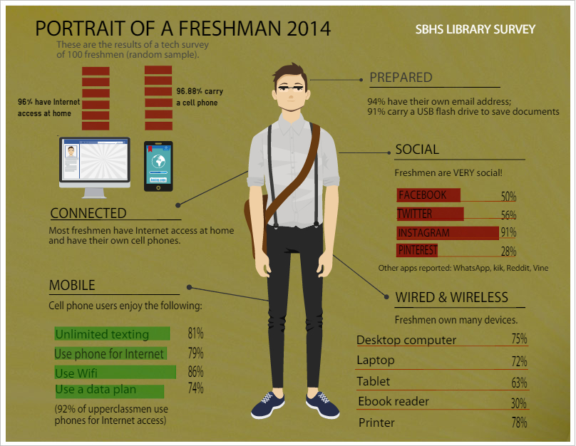
Pictured above are the results of a survey we conducted in the fall of entering freshmen, in an effort to get a snapshot of their technology habits. Not surprisingly, 96% of those surveyed have Internet access, AND 96% carry a cell phone. It was interesting to note a few differences between freshmen and upperclassmen (surveyed separately), with more upperclassmen than freshmen using their phones to access the Internet. We also noticed a shift in social media use compared with last year's results: Twitter use among freshmen is increasing, but is still not as high as use by older students. Instagram use is on the rise, and is actually higher among freshman than among upperclassmen! If you'd like to leverage the seductive allure of social media and the power of the 140-character tweet in your own classroom, see "50 Ways to Use Twitter in The Classroom." Imagine that, 50!
The online tool we used to create our cool "Freshman Portrait" infographic is Easel.ly, which is one among several we found for creating visual representations of data. These tools are fairly easy to use, most are FREE, and all offer ways to promote digital and visual literacy with students. Drag and drop features plus a nice assortment of pre-made templates offer easy ways for students to create flashy and professional-looking projects representing data. An infographic is applicable in most subject areas and can be used by students (or teachers) to display cause and effect, a timeline or chronology of events, similarity and differences, and attributes or characteristics. The easiest to use is probably Piktochart, but others include Infogr.am and of course, Easel.ly, the one we used for our freshman pic. There are at least 46 more! Read "46 Tools to Make Infographics in the Classroom."
The online tool we used to create our cool "Freshman Portrait" infographic is Easel.ly, which is one among several we found for creating visual representations of data. These tools are fairly easy to use, most are FREE, and all offer ways to promote digital and visual literacy with students. Drag and drop features plus a nice assortment of pre-made templates offer easy ways for students to create flashy and professional-looking projects representing data. An infographic is applicable in most subject areas and can be used by students (or teachers) to display cause and effect, a timeline or chronology of events, similarity and differences, and attributes or characteristics. The easiest to use is probably Piktochart, but others include Infogr.am and of course, Easel.ly, the one we used for our freshman pic. There are at least 46 more! Read "46 Tools to Make Infographics in the Classroom."
